SAAFON
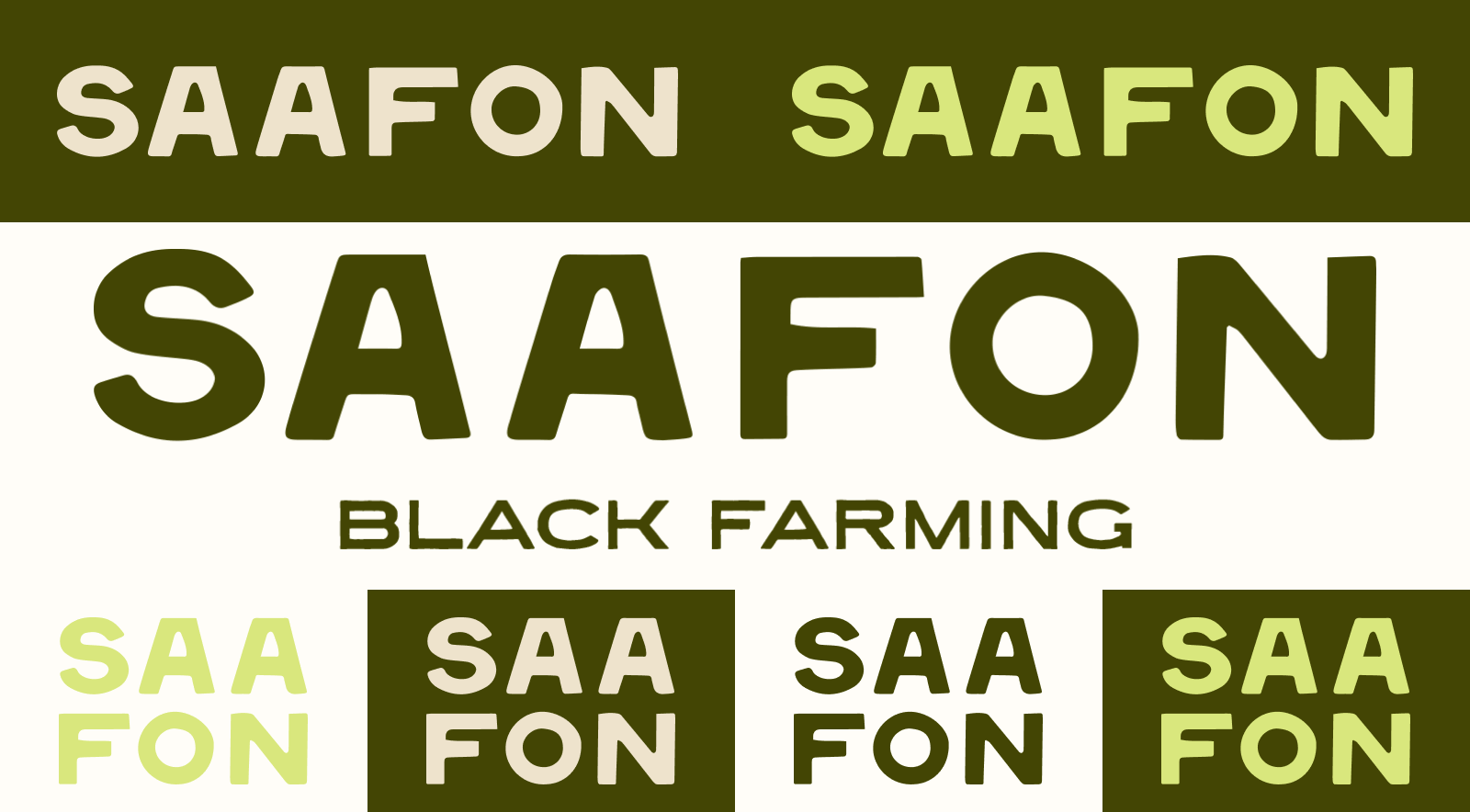
Rebrand for Atlanta, GA based nonprofit Southeastern African American Farmers’ Organic Network (SAAFON). SAAFON was looking for an identity that would celebrate Black farmers’ collective power the rich history of Black land stewardship. The identity leans heavily in to a hand-hewn approach seen in the logo, typography, and hand-cut crop illustrations. Regional quilt patterns, pulled from history, were deconstructed and utilized as branded framing devices.
Made at SMAKK Studios
Creative Direction: Ollie Ennis & Raquel Benedict
BRANDING | ILLUSTRATION